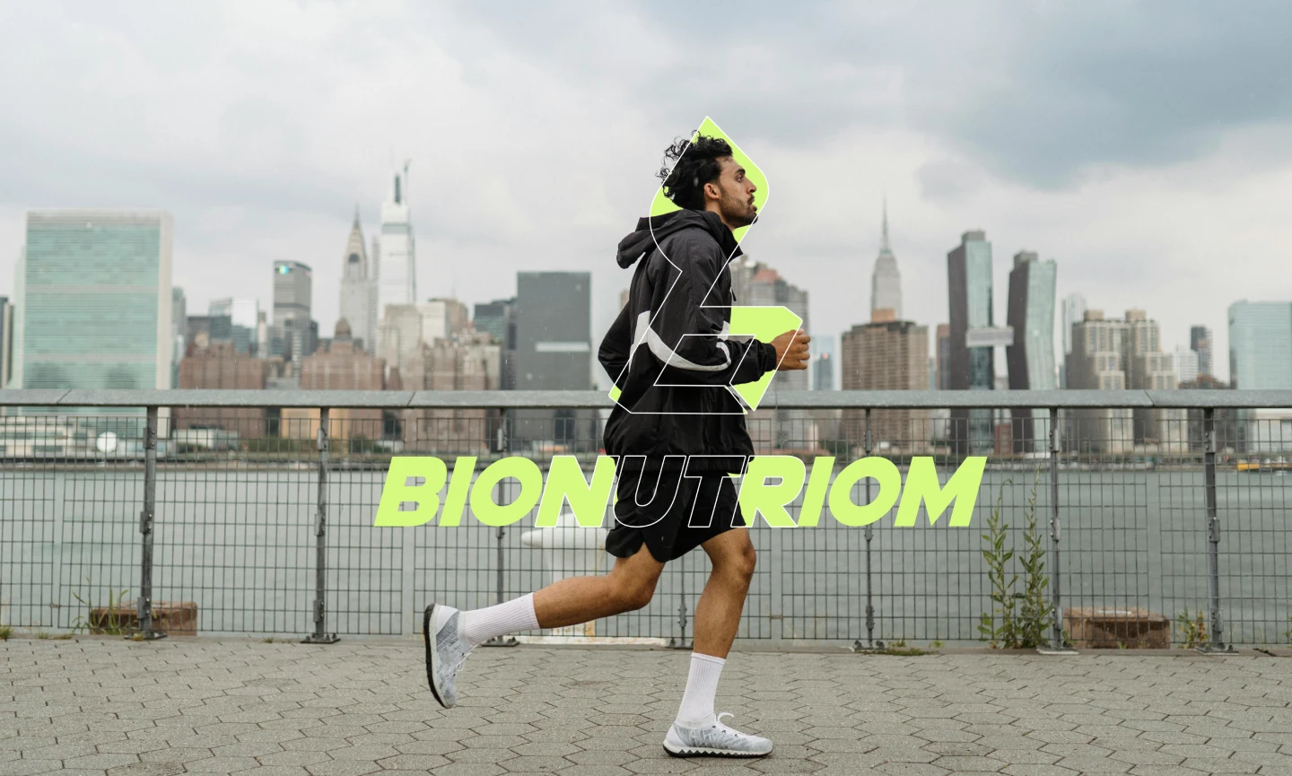
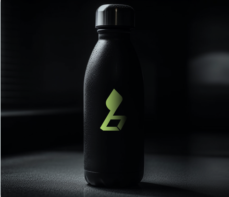
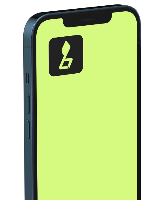
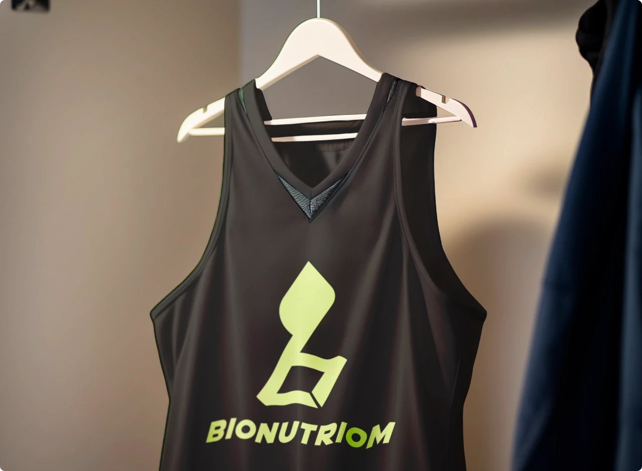
The goal was to create a brand identity that reflects Bionutriom’s commitment to natural ingredients and holistic wellness. The logo design centers around the initial “B,” cleverly integrated with a stylized leaf to symbolize the brand’s organic focus.
Problem:
Bionutriom, a new entrant in the competitive fitness supplement market, needed a strong brand identity to stand out and communicate its unique selling proposition: natural, high-quality ingredients.
Solution:
A logo that combines the brand’s initial “B” with a stylized leaf, symbolizing the natural and organic nature of its products. The clean, minimalist design conveys a sense of trust and reliability, while the leaf adds a touch of freshness and vitality.